Showing posts with label logo design. Show all posts

Logo Design // Lana Cordes, Realtor

Logo design is always some of my favorite work. I really enjoy the whole process, starting with hearing about the client's vision and translating that in to some initial design concepts. The process can be made even more fun, or maybe just a little easier, when I am working with some one I know well. When I know some one, I typically can "get" their vision even quicker and hone in on what they are wanting easier. Such was the case with Lana Cordes, a friend who I have know literally since I was born. Some use that phrase as a figure of speech but in this case it is the literal truth.

Lana became a Realtor specializing in the residential Denver market in January, and she came to me to help her with her personal Realtor brand. After we talked back and forth and she put together a Pinterest inspiration board, these are the initial designs I sent over to Lana ...
I feel like part of the fun on this whole process is seeing the initial design concepts and then seeing the final product. And, this is the final logo we arrived at:
And that logo is in a classy navy blue, by the way, as dictated by the accompanying brand guide.
And lastly, business cards:

I am super excited for Lana and this new venture. And, to work with her some more on a few more branding and collateral pieces. You can find out more about Lana on DenverSweetHome.com.

logo design // union jack freebies


Another logo for the sweepstakes sites I design logos for ... this one is a no-brainer as to which country it is for!

And this project was a super quick and easy one; we went from five concepts to the final logo in one round of drafts!

Obviously all the concepts worked off of a very strong theme of the British flag, or in the case of the lower left, the iconic Underground logo.

logo design // jamie hanley


Before my California trip I was working on and finishing up this logo for Jamie Hanley. I find her work, which combines psychotherapy and yoga to heal, fascinating. For her logo, she was very certain about what she wanted; the logo had a "must include list." That list included a lotus flower and that lotus flower had to be watercolor in style. She had also thought about wanting to go an inkblot direction, but once we started working on the design it was clear things could get way too busy if we included a watercolor style and an inkblot aspect to the design.

All of Jamie's must-haves came together as the final logo above and the nitty gritty of the brand is detailed below in the brand guidelines.


a little note: You also get a sneak peak at my new branding on the bottom of Jamie's brand guidelines. I am working on consolidating all of my businesses - freelance design, custom paper goods design, REMEMBER the days, etc. all under one more consolidated roof. It will mean a new website (chloemarty.com) instead of my existing hellotheredesign.com and I think it will just make more sense to have everything under me, as in under my name. I am almost done with the website, but it is kind of a backseat to other projects so I am totally not sure when I will actually finish it and launch it. Anyways, I have started using with clients and you get the sneak peek here!

logo design // sweepstakes sites

I do design work for a client whose company runs lead generation/sweepstakes sites. They have been launching sites in various markets around the world and these are the logos they had me make for three different international markets. 

These logos are a fun deviation from the typical industries and markets that I design for. With these logos, we use the country's flag as a starting place for the design. I bet you can {easily} guess the top and middle, but that last one is trickier!

logo design // apollo digital ads

Several months ago I worked on a logo for Apollo Digital Ads. When I share logos here on the blog, I like to share some of the initial concepts that came up on the road to the final blog ... when they are worth sharing that is. So here is some of the initial designs I provided to the client.

This logo was a lot of fun to work on because of the style the client was interested in ... kind of that vintage-y, Jetsons feel.

The final logo boiled down to this:

crystal springs brewery // rebranding

My John was working on a project for his marketing and operations classes as part of his MBA last semester. His group took on the case of Boulder/Louisville based brewery; assessing its operations and marketing strategy. Among other things, they identified the necessity of rebranding.

existing logo in use by Crystal Springs Brewery
Now, most would have no reason to know this, but John has an eye for design. I ask him to pursue this all the time - take on clients do not have the time to accept. He is that good. So, with a recommendation for rebranding, he went a step further and decided to show his "client" what that rebranding could look like. He worked up some logo concepts for Crystal Springs Brewery.


logo concepts designed by John Marty
John wanted to maintain the focus on the rich history of this brand, but give the logo more appeal. He ventured after a vintage-feeling logo as opposed to an antique one.

Now is the point he brought me on board. We selected one of the logos from the concepts he had drafted, refined it slightly, and said "this is it!". Typically the client would go through this process with the designer, but in this case John wanted to present the finished suggested rebranding to the client so we kept this process in-house, so to speak.

final logo in color variations


Next up we visited the packaging which was also identified as needing to be re-thought out. The existing packaging was found to be lacking in design appeal and also did not have a consistent design aesthetic.

Using our final logo, I took the helm and created some packaging mock-ups with the branding colors we had selected.

packaging mock-ups designed by John Marty and myself
Just as John went for a vintage feel for the logo, the colors we selected had a retro/vintage feel as well. In contrast to the existing packaging that has little consistency, we went for uber consistency here having each can follow the same mountainscape silhouette theme and just changing the brew style (i.e. IPA) and Crystal Springs specific name (i.e. "Marilyn").

This project was a lot of fun to work on for many reasons ... the industry and product are much different than my usual client. And, getting a chance to work with John really gave me the bug to work with him more - husband + wife design studio, yes please.

logo // hello there, design

On a whim earlier this week, I revised my hello there, design logo. For those who do not know, hello there, design is the business under which I do graphic design.

I was looking for a logo that was easier to read, as I felt the typefaces in my previous logo were to thin. I also wasn't feeling like the "old" logo fit me anymore. So, I quickly changed it up. I kept the little comma, but made it less of a dominant design element. I also put the focus on "DESIGN". Honestly, I was so tired of the old logo, I felt like any update to the logo was an improvement. I am happy with this logo for now, but I would not be surprised if I change it up again soon. When I say that I revised the logo on a whim is accurate, along with saying that it was a very quick revision. I would like to spend more time and tweak it a little further. This new one will work for now though.

logo revision :: taking cara babies

I needed some sleep guidance. Little John sleeps well at night, but he is waking up earlier than I would like him to. He takes a morning nap, but I think he needs an afternoon one too. So, I got in touch with Cara of Taking Cara Babies; she is a former neo-natal nurse and mom of 4. She does all sorts of baby consulting, but has begun to focus on more of the sleep consulting and training part of her business.

When I contacted her, she proposed a trade: sleep consultations in return for some logo help. She had a very cute existing logo, but the text part of it was difficult to read and she had found that it was not translating well across different applications. She also happened to not have a vector of her logo. So, I redrew her logo so now she has a vector and I revised the text portion of her logo.

I sent some typeface samples over to her and from her feedback I delivered the following options:

Cara selected logo concept A, and after some cleaning up it will now replace her old logo.

logo design :: eb designs

It has been a while since I have shared any logo designs I have worked on, so today I am sharing a logo that is actually still a work in progress. These are the initial logo concepts that I provided to my client an we are now farther down the logo design process road refining a chosen concept. I wanted to share the initial concepts, one because we aren't finished so I don't want to post an unfinished logo. And, two because I just really like all of these.

Often when I work on a logo and present four to six initial concepts to a client, I have a definite favorite that I leans towards. In this case, I have that favorite as usual. And, as is sometimes the case, my favorite is not the client's favorite and it can be difficult to say "bye" to the concepts that get "thrown out." Sharing the initial concepts is an opportunity to put my favorite out there that otherwise won't be seen.

Can you guess which one is my favorite? Which one do you like the best?

custom illustration :: watermelon limeade

I am on retainer for Pretty-Bras for Nursing Moms ... I do Jenny's graphic design, stuff like the graphics for her family 5K and watermarking of her photos. For her new summer collection of ready-to-wear silk bracelets and wraps, she needed some graphics. The collection is named "Watermelon Limeade" for the color inspiration behind the collection as well the fact that a recipe for watermelon limeade comes with each piece. I was in charge of the graphics, as usual, and from some of the photos that Jenny sent me I decided to do an illustration ... I was inspired by this photo of the watermelon limeade:

From there I came up with this simple, line-drawn illustration to represent the collection along with a collection logo:

This collection branding will go on the collateral and webpage for the Watermelon Limeade collection. You can see it in action on Jenny's website, Pretty-Bras for Nursing Moms.You can purchase pieces from the collection in the PRETTY by JL shop with a release date of July 15.

{Photo courtesy of Jenny.}

more on identity design for AIMbaby

So last week I shared some of my thoughts on identity design as well as the logo design I was working on for AIMbaby. As I continue the identity design process with my client, we have finalized her brand/identity/logo guidelines and business card designs.

Last week I mentioned the importance of defining and setting guidelines, and this is usually done in a PDF/document like this one:
The PDF/document defines:

  • the logo and its variations
  • the typefaces that are used in the logo and other collateral
  • the colors
  • any icons that are suitable for use in collateral, in this case it is the elements that make up the logo broken apart
  • how the business name should be written/typed in plain text
Here is a closer look at the sections of this document:
The business cards are the next piece in AIMbaby's identity that I am sharing today.

My client and I decided upon kraft paper stock for her business cards. And, there will be two versions; one with just her her website and Etsy shop and website and another with her name plus these web addresses. Each card serves a different purpose.

And, yes, as you see my client is my sister! Although she is my sister and that in and of itself makes this a fun project, at the same time my process and relationship with her in terms of working to craft her brand identity are the same as if I were working with any other client. 

{Note: The web addresses on the business card mock-up are not live yet and are subject to change.}

From here, the next step is to move forward with opening up shop on Etsy, which Jonna will work on and I will assist by providing the necessary graphics that she needs for her shop. We will also be setting up her website, which for the time being will be a landing page. After the Etsy shop and website, this project will be essentially complete; although I will continue to offer my design services as needed when a new piece of design or marketing collateral is needed.

And, I will keep you posted on the official launch of AIMbaby!

thoughts on identity design + logo design for AIMbaby

I am in the middle of a project of designing the identity for a new business for a client of mine {I refrain from sharing what that business is just yet, but will in the future}.

I love projects like these because I love crafting brand identities; working closely with my client to marry business and creativity through the creation of brand identities and logos. My passion for collaborating and creating identities that communicate the authentic identity of a company, what it does, and its values are at the core of this type of design work.

Crafting an identity starts with research - research about the business, its goals, its values, its products/services, and its customers (target audience). This research includes interviews with my client, as well as my own independent research on the company and its industry and competition. Clients are always a little surprised how much attention goes into the first part of the process, and are often anxious to get to the design stage. They understand the design phase and see the value in paying for the time I spend designing; the design stage produces tangible results. The research phase, however, sometimes requires explanation to help my clients understand why it is just as important as the design stage, and why my time conducting research is just as valuable.

The ultimate goal is to not only create an identity that is well done from a design perspective, but to also have that identity be relevant, timeless, memorable, and relatable. A successful identity needs to be these things to the target audience most of all, but in a general sense to some degree as well.

There are so many pieces that make up a brand identity; the logo, business cards and other marketing collateral, web design, other graphic materials, etc. In addition to designing all of these pieces that make up the brand identity, creating an identity also includes defining and setting guidelines for that identity to ensure that it is represented and implemented with consistency in every instance. This consistency is key to creating brand awareness and brand recognition, which will hopefully lead to brand loyalty as well.

Typically the first element that is created in the design process is the logo, as it carries over to most if not all other pieces of the identity. And, it is the primary communicative element of the identity. I hesitate to call it the most important, because all the pieces must work together to create a cohesive identity, but it is certainly the most seen piece of the identity, maybe it is appropriate to call it the centerpiece of the identity.

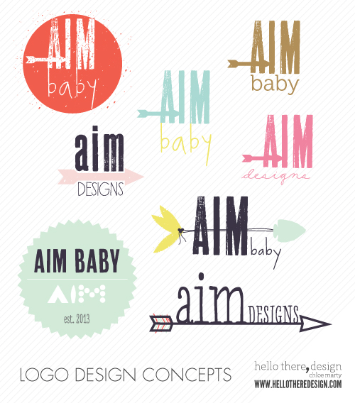
This week, I just finished the logo for the identity I mentioned in the beginning of this post. Like I have done in the past (here and here), I will start by sharing a glimpse at the design process that got us to our final logo. Here are some of the concept ideas that I designed for this identity:

This glimpse fails to show the whole process which included initial concepts in black and white, some revisions, discussions on color, color studies for the "finalists", etc. but in the end my client has chosen the final logo to be:

From here we will work on the other pieces that will make up the identity ... marketing collateral, elements that make up the product packaging, the graphics for its web presence, etc.

I cannot wait to share more about the company behind this logo, including the meaning behind the name, its products (which I have a design-hand in), and ultimately the reveal of its web/e-commerce presence. I will reveal more as the timing is right.


logo design :: sleeping beauty ranch

Back in January, I shared a little bit about my process of designing a logo. I just wrapped up another logo design project and I thought I would share it as well.

My client contacted me to design a logo for her wedding and events business/property. She and her husband have a beautiful property in Animas Valley near Durango, Colorado which can be reserved for weddings and events. She had a great website but was not happy with the logo that was on it as a "placeholder". So she contacted me to design a logo for use on her website, as well as for use in other marketing materials.

The feel of the logo needed to fit Colorado, mountains, rustic, etc. but she also wanted it to feel modern. It needed to be appropriate for not only the wedding side of the business, but also for the corporate event side of the business.

Here are some of the initial designs that we tossed around.

Interestingly, the logo took on a decidedly western feel, and most of the concepts had a rustic, yet modern feel.

We refined the logo to this design, which is now installed on her website along with a new favicon.

Along with a neutral color, we also added some woodgrain. The logo has a transparent background so that despite the woodgrain, it still maintains its transparency to the images that rotate on the home page behind the navigation bar on the left.

The logo has two versions for use outside of the website; a white/transparent background version and a dark background version. Depending on the application of the logo, one or the other can be used.

I love the way this logo turned out. I would love to design some business cards around these beauties now! I am thinking kraft paper could be absolutely beautiful...

what's in a name + thoughts on monograms

Naming your kid. That's a lot a pressure. Or at least that is what we are feeling/finding our as we try to think what to name our boy. Sure, we have another few months and we even have three names that I think any one of would be a good choice. But, I still wonder, is his name out there and I have not found it yet.

I am not going to share our three name picks here - at least not yet. But I want to hear more names ... I want more ideas. I am keeping my ear out, as they say.

Here is our name-picking criteria (please, no one take offense to names I use as examples here; this is just my little opinion and I mean no harm):

  • cannot be trendy/popular: so no Aiden, Jack, Jacob, Max, etc. {I realize many of these names are pretty "classic" but I consider them trendy because they are so popular right now.}
  • cannot rhyme with something bad: for example my sister quickly crossed Jack off of her list of potential names because then her boy would have been Jack Markoff, which cruel kids could easily shorten to "Jackoff"
  • initials cannot spell something undesireable: I don't want an ASS, ADD, HAG, FUG, ILL, etc. {granted our last name is an M, so none of those would be possible, but hey they are just examples}
  • unique but not too unique: I want a name that is not too popular or trendy (see above), but I also don't want a name that is too unique ... for example, we had Calixto (cal-iks-toe) and although I am not ready to cross it off my long list just yet, I feel like it is maybe a little too unique
  • has to sound good with Marty: so most of the time we say our first and last name (rarely to we say our full names); I am more often Chloe Marty than Chloe Christine Marty ... I want my boy's name to sound good as "first name last name" as well as "first name middle name last name" {which warrants the disclosure that at this point Raphael, which is John's middle name, is the front runner for middle name}
So the purpose of my post today is two-fold ... first, if you have any good names that you think fit my criteria please shout them out in the comments. Like I said, I want to generate more ideas. Secondly, if you have any good naming tips, superstitions, folklore, etc. {for example, someone advised John that we need to check the numerology of the name before we finalize it ... you want a name to be like a 9 or 10}.

I figured this could be helpful for me, but fun for you, too. And, I will definitely share our name pick later on, certainly when our boy arrives at the very least.

a thought on monograms ... 

I choose the logotypes above because they reminded me of monograms. I love the idea of creating a distinctive monogram ... not just the stock one that Lands' End or Pottery Barn will embroider for you, but a true personal logo and a genuine brand for oneself. I think these logotypes are intriguing examples of this. Although they happen to be logos, I could see the one in the center as being a monogram for one Declan Masterson. 

I found these logotype here clockwise from top-left: H :: DM :: BWD :: SDS :: AW and there are a few more on my "logos and logotypes" Pinterest board here, here, and here

tiny details :: logo design process

Last week when I was working on a logo design for a client, I posted this blurry image to Instagram after I sent the initial logo drafts to my client. I didn't feel comfortable posting the designs to the world before my client had picked through them, but the image got a lot of response and I received emails from people wanting to know more.

So, since my client has since picked their logo and we are down the road in the process, I decided to share more about that blurry image.

I feel like every logo design project is very different, and for each project my process and method changes to suit that particular situation. For this logo, the client had given me some clear direction as to where she wanted to take her logo. This logo is for her doll clothing and accessory business which includes dollhouse furniture and accessories (hence, the tiny in Tiny Details). The antique doll business is actually an off-shoot of her main antiquing business that she has operated for many years (Porcelain Affair).

She was inspired by vintage doll tags and she sent me over several photos of some great antique doll tags. I knew immediately that this project would be fun because the vintage-style really spoke to me and I instantly had several ideas.

I started by doing some research on vintage dolls and vintage tag design. Then, I created a pin board with some inspiration - the images my client had sent me as well as some vintage-inspired logos and some typefaces that I thought might be a good fit.

Next up came some sketching ... for some projects I do a lot of sketching before moving things digital. In other cases, I do a little sketching and hop right into Illustrator quite quickly. This project was an instance of the latter. And after getting all my ideas down in what becomes a mess of a computer screen, I ended up with these concepts to present to my client:
I keep these initial designs black and white (we talk color later).  Although I typically have favorites by this point, I bite my tongue and wait to see where my client ends up. The hope here is always that they see something they love ... even though there is still more refining to come; if a client has a good positive reaction to one or more of the designs now, I feel on top of the world.

Luckily, my client found a logo among these that she loves so we are on to the next steps.

The next steps are to refine the design and add color (unless she decides to stick to black and white). Then, I prep all the final logo files in various formats for my client, as well as prepare a logo guideline document, if they require one. In this case we will also be moving forward to design some tags and business cards.

So, that is a little, simplified glimpse into my journey with a logo, or at least this one.

Which concept here is your favorite? Later down the road, I will share the final logo the client selected.

LinkWithin

Related Posts Plugin for WordPress, Blogger...

ShareThis